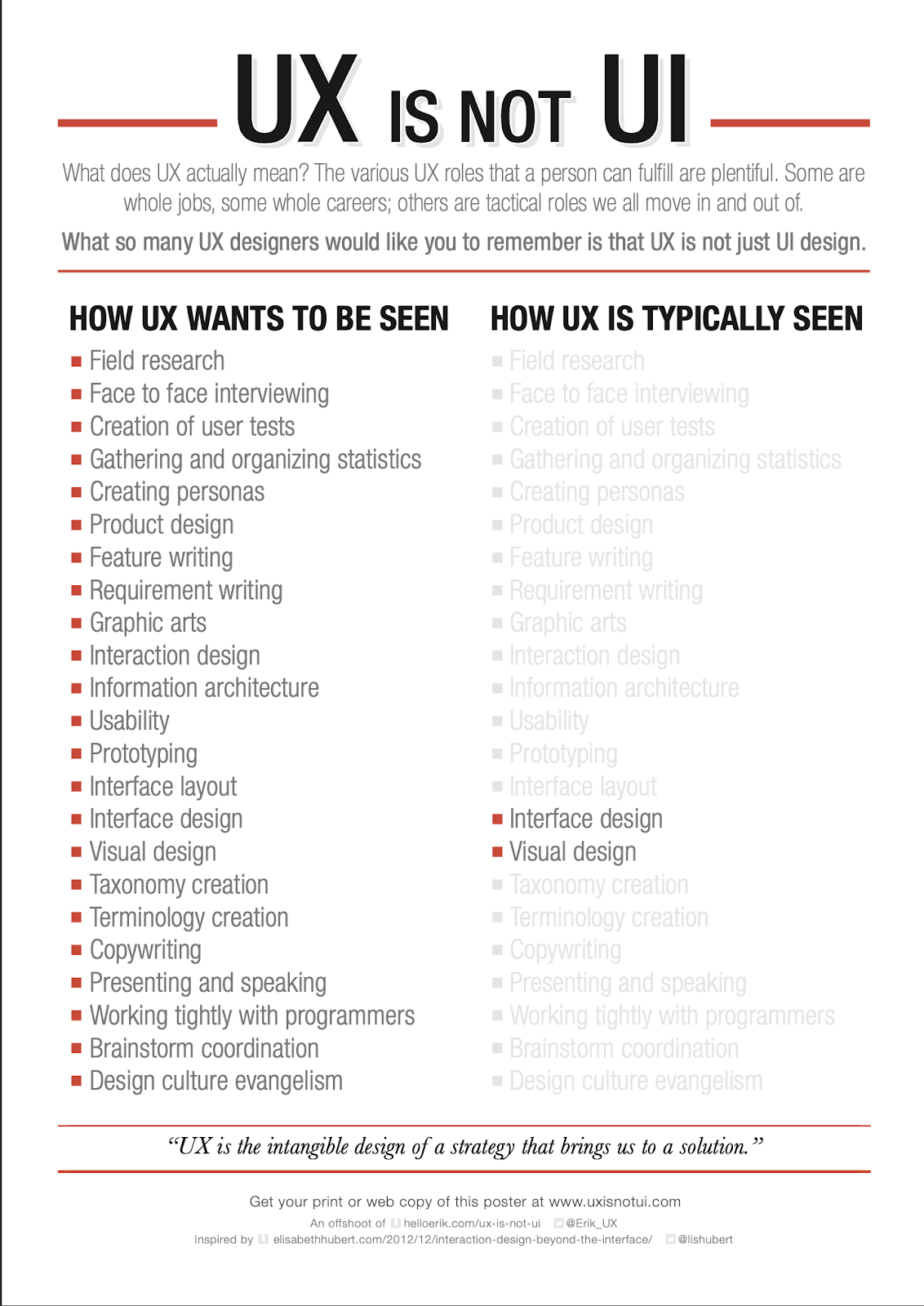
UI Design
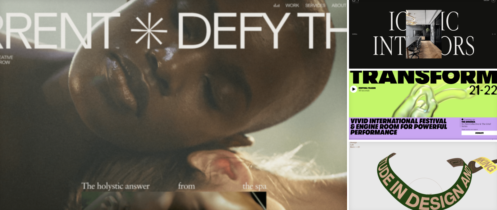
1. Text gigantism + New fonts
2. Brutalism
3. Retro Nostalgia
4. Authenticity
5. Smoothness
6. Tabularity
7. Sketching
8. Very bright Colors
10. Minimalism
11. Modernized 3D elements
None
13. AR & VR
14. Emotional Design
15. Geometric Structure
16. Dark Design
17. Split-Screen Design
Important points to keep in mind at all times
3D on the user interface
Color Harmony
Animation
Product illustration and the culture of its creator
Asymmetry
Real pictures
Current Changes
Neomorhism
Glassmorphism
Pastel colors
Scroll
Material Design 3
UX Design
Dark mode
Abstract Data Visualization
User experience comes first.
Inclusive Design
Manual or voice search?
Microinteraction
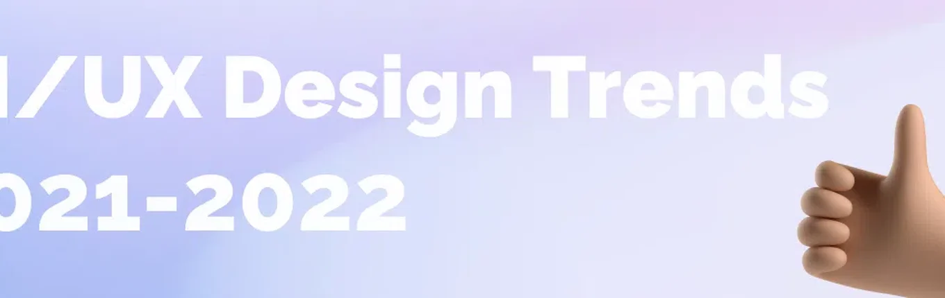
Design Trends 2022
In 2020-2021, graphic design trends were determined by bright events. The first and foremost among them is the pandemic. The world is slowly but surely recovering.
There is a noticeable shift towards inclusiveness, and brands are trying to back up their services and products with statistics and facts. Bright colors are increasingly used. Graphic design will continue to inspire and influence cultural change. After all, imagine how boring life would be if the design did not change. Therefore, it is worth taking into account the trends that will work for the next few years.
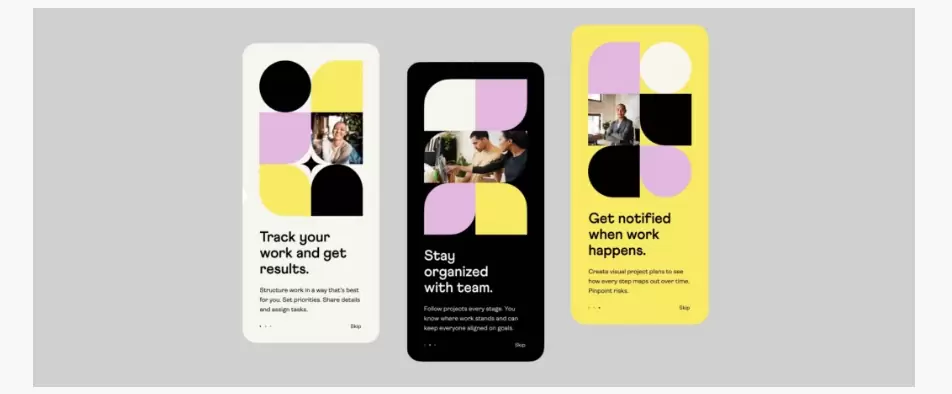
UI Design
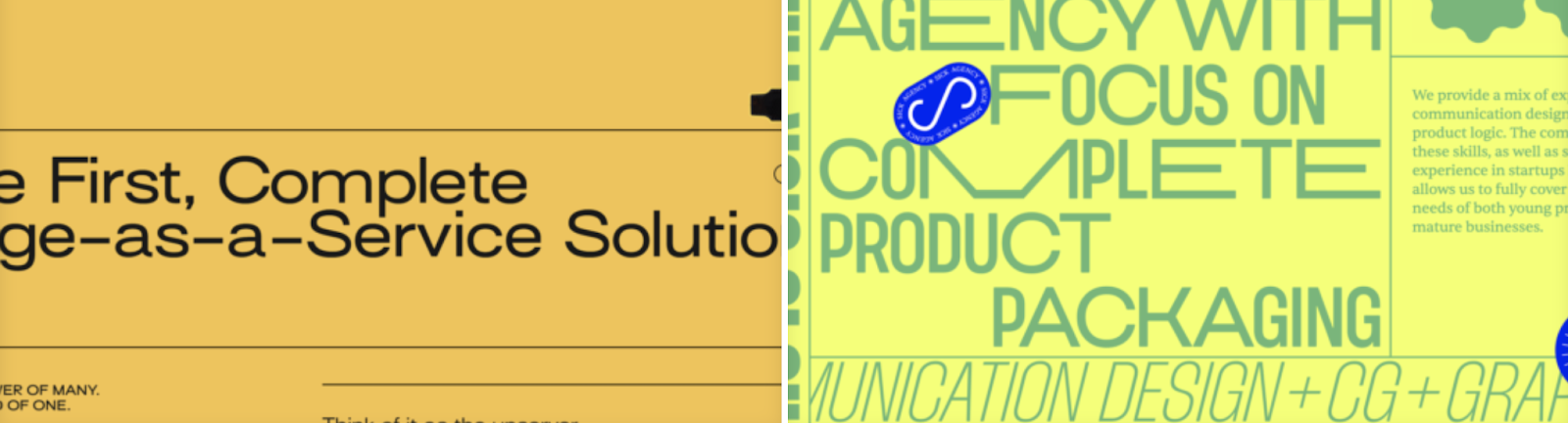
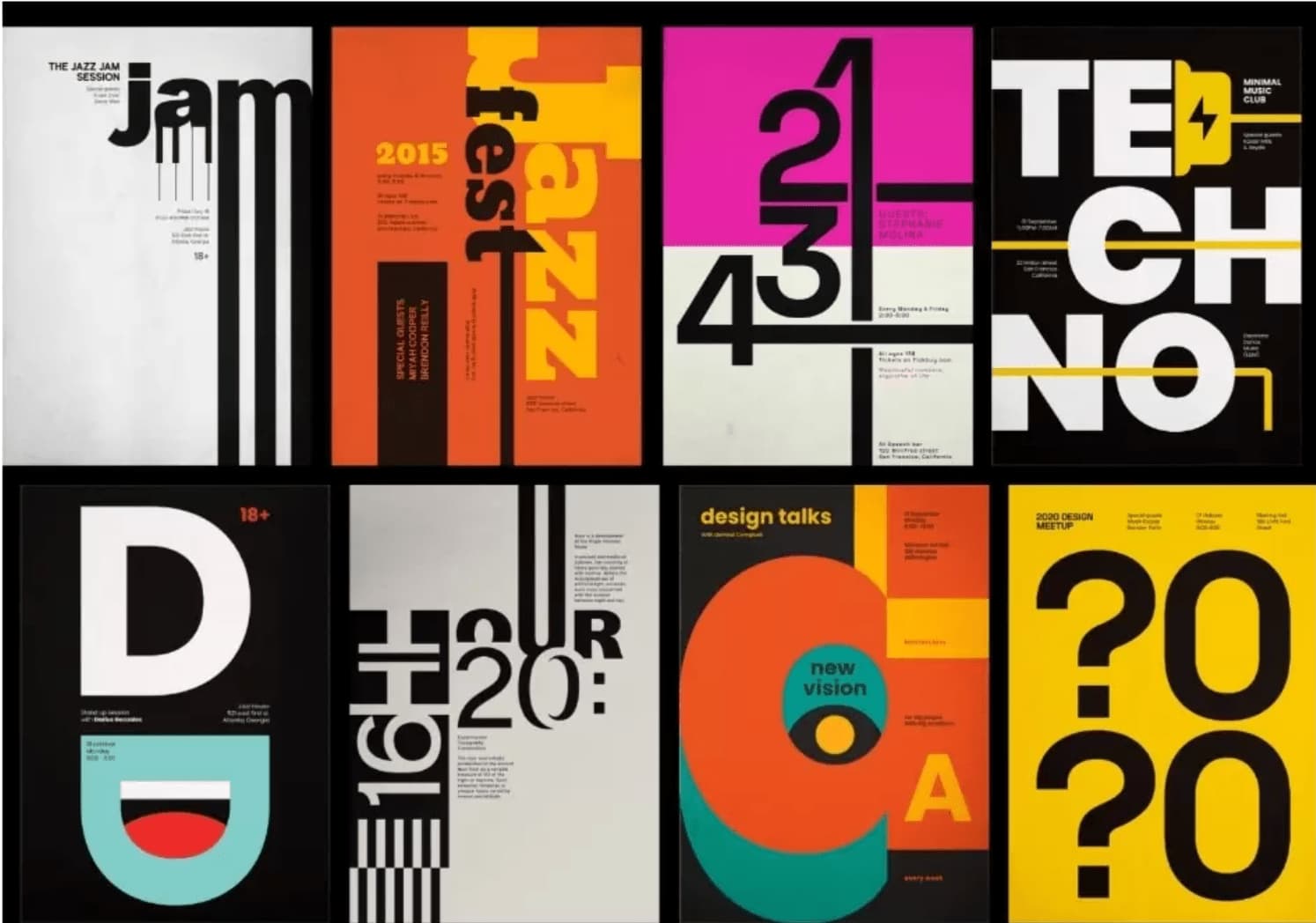
1. Text gigantism + New fonts
The typography on the site is getting bigger and bigger. And rightly so, because the headline is the first thing that gets attention, and the bigger it is, the more it will show up.
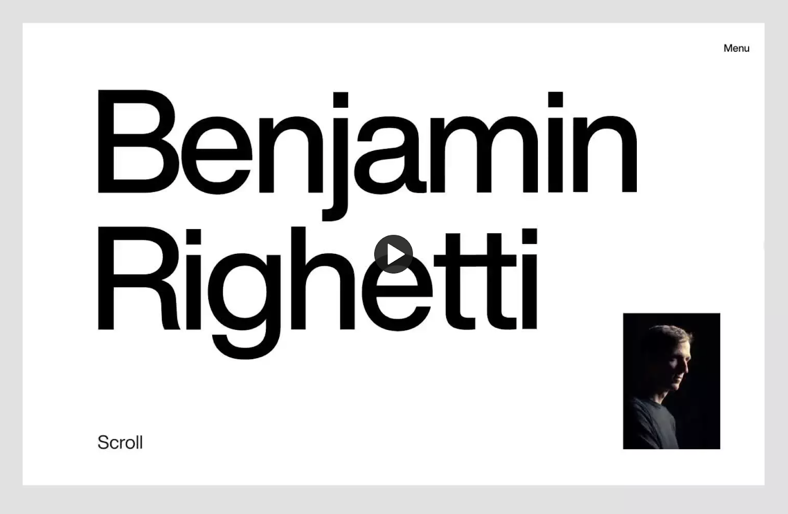
If we talk about what exactly should be the text and its size on the site, then everything is ambiguous. However, you can accurately emphasize the fact that the shorter the headings, the more they can make, and thus add more emphasis. Of course, there are also good examples of the use of long headlines, they in turn play a key role in the composition of the frame.
Therefore, the size of the font on the site will grow exponentially, in the near future, and it is inevitable.
2. Brutalism
Brutalism is a bold, rough, raw style that does not strive for perfection, it is an echo of early 90's websites. This style is often referred to as "anti-design" because of its roughness and sloppiness.
Brutalism has no soft shapes, shadows or the like, only rough shapes, special visual errors, no animation, symmetry and color compatibility. If images are used, they are often in black and white style and not processed.
Therefore, this direction is gaining more and more momentum, because brutalism attracts as something new and paradoxical.
3. Retro Nostalgia
Remember what we feel when we look at old pictures, games, things. A warm feeling of nostalgia comes over us. Designers like to play on the feelings of users, so, use this trick in web design.
Many things can evoke nostalgia in our design, such as the use of noise, textures, bright colors like in old games, and fonts that are inspired by the Soviet past. All of these things, can evoke emotion and therefore work to the client's advantage.
4. Authenticity
Authenticity is a new trend born out of a variety of different visual solutions. In principle, this trend well describes the whole situation in today's design world.
Authenticity means being outside the box, the more unusual the better. It is the ability to combine the incompatible, to make it so that the user remains perplexed by what he sees. It is also the work with meanings, ideas, and presentation of information.
5. Smoothness
The smoothness of the scrolling, animation of various elements, such as text and photos, adds a kind of premium feel to a website that many developers strive to achieve.
Some sites get overwhelmed by animation, it makes it difficult to use and confusing. Consequently, to use animation should not be overused and understand the basic principles of animated elements on the site.
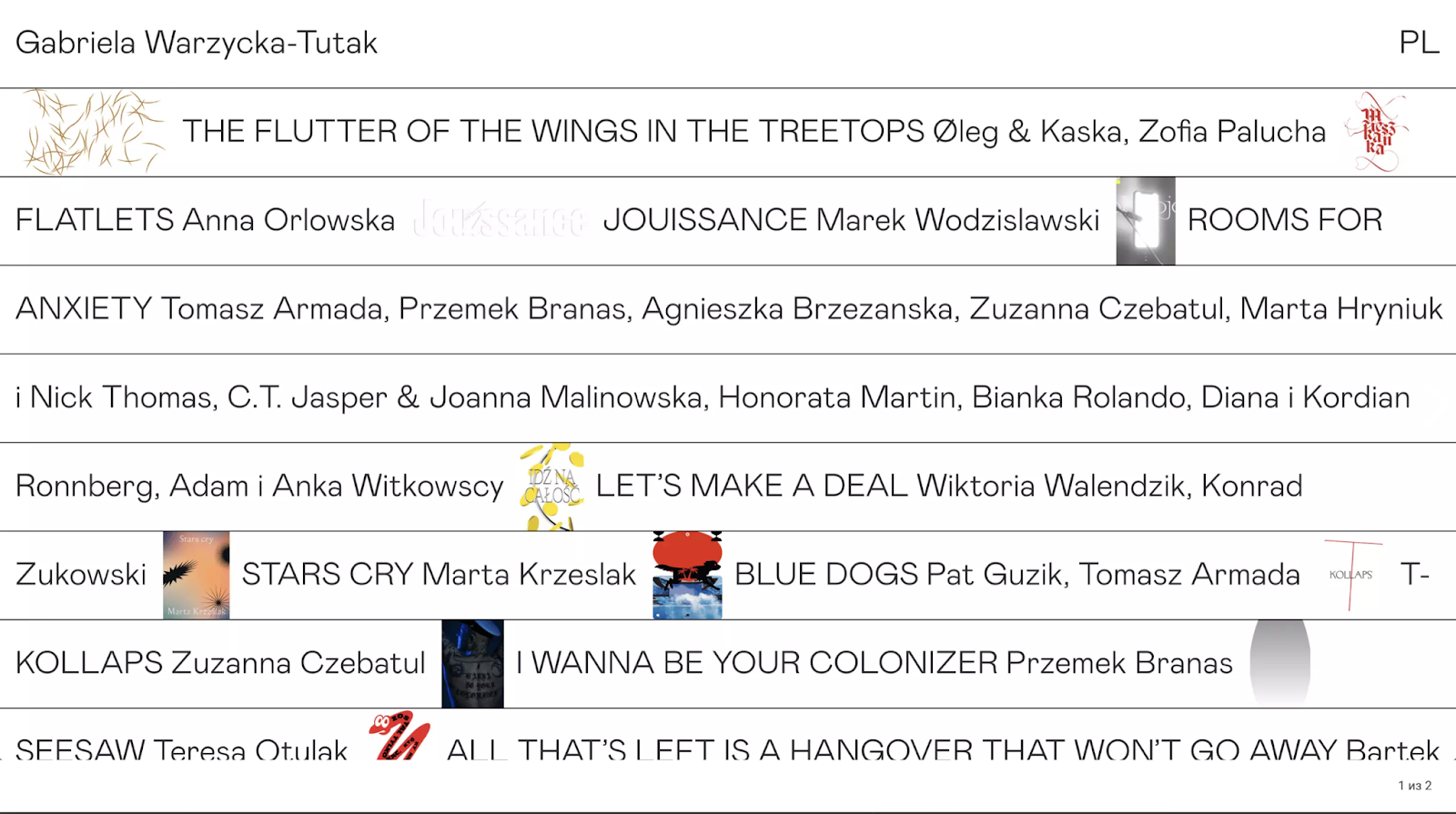
6. Tabularity
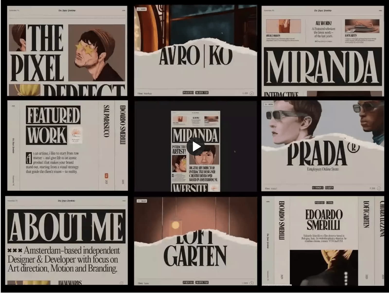
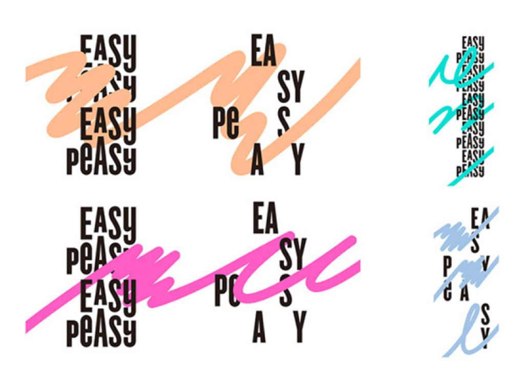
7. Sketching
Various doodles and hand drawings have become very popular in modern web design. More often than not, they look unkempt and minimalistic, which adds to the design's uniqueness and "own handwriting’’.
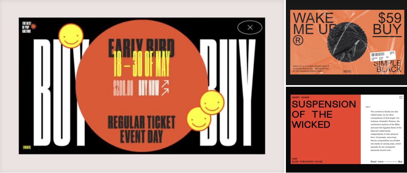
8. Very bright Colors
The trend for bright colors stems indirectly from the retro design trend, as all bright colors go back to the 80s. Acidic, puckering colors are increasingly seen on websites, and they are good for attracting attention and looking unusual. It helps to stand out among the hundreds of competitors' sites, which means it works to the company's advantage.
Most in demand is warm shades of colors: red, yellow, orange, green. This is due to the fact that warm colors are more striking to the eye, well combined with each other and more pleasant to the human eye.
9. Black-White Style
The BW style is suitable for thematic sites, longreads related to history, biography, and art. It conveys rigor and consistency, which also needs to be conveyed in some projects.
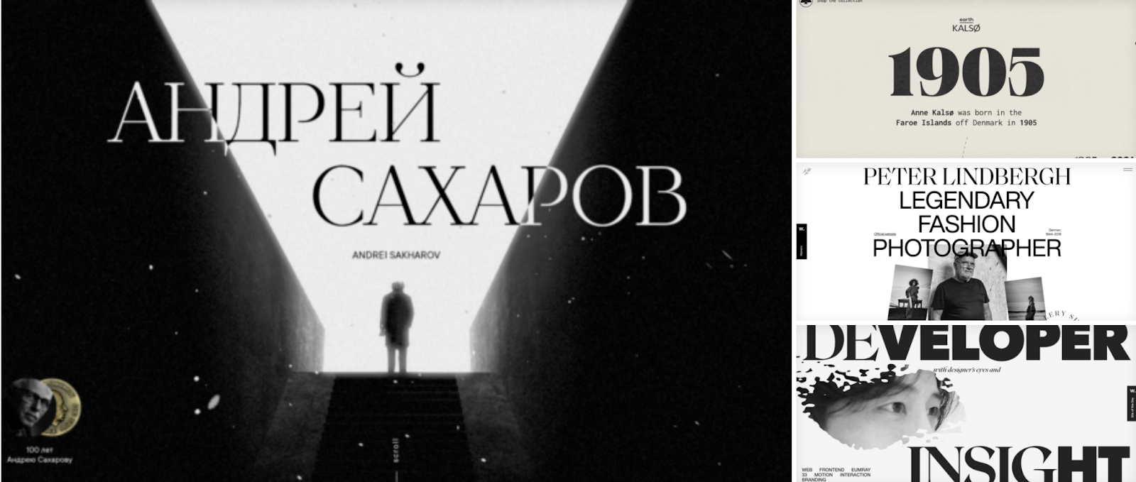
Therefore, such works well convey the spirit of the time and immersed in a certain mood.
10. Minimalism
A simple and straightforward site will always be pleasing to the user, will make good traffic. Despite all the trends that have been listed above, it is important to create a minimalist site, not to put elements randomly, not to overload the style.
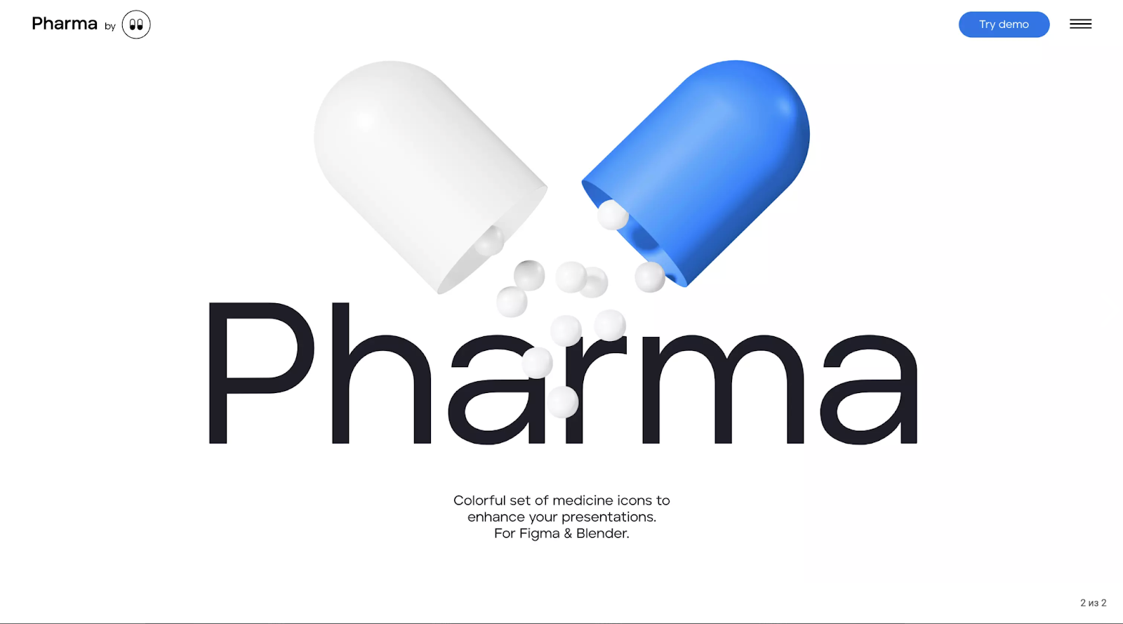
11. Modernized 3D elements
Visual effects perfectly attract the attention of the potential audience, fully demonstrate the virtual space.
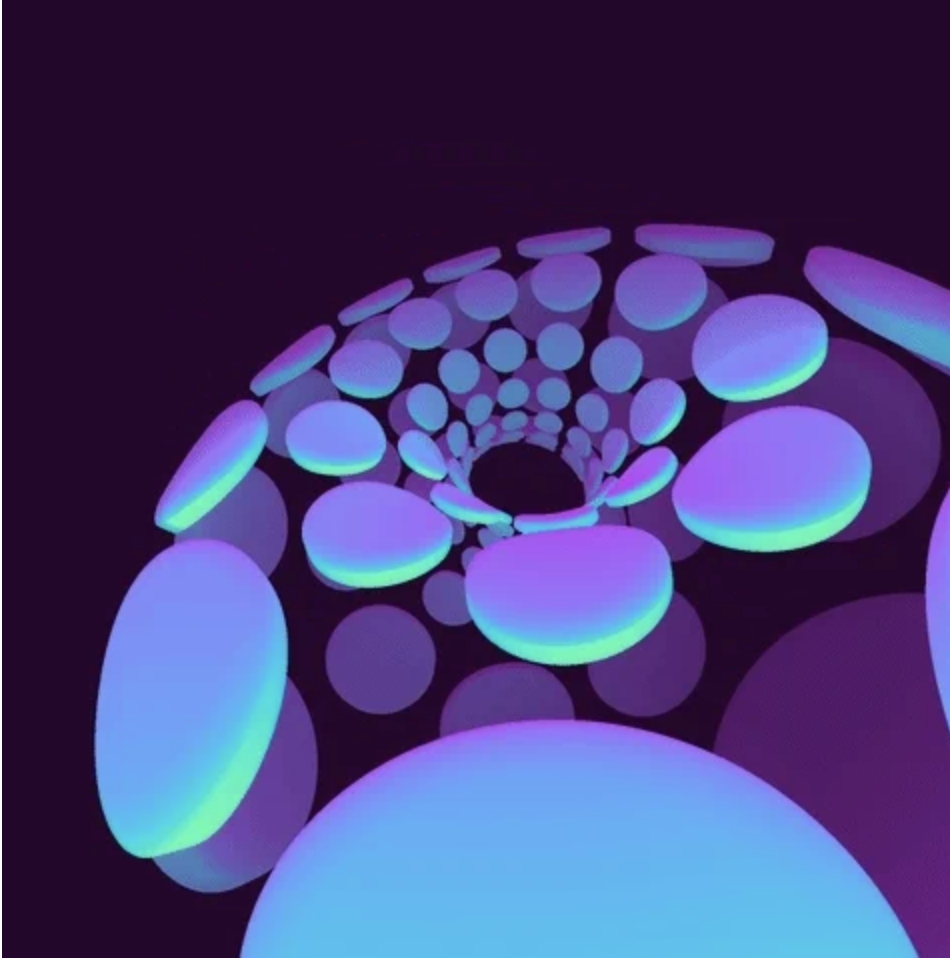
12. Abstract Visualization
13. AR & VR
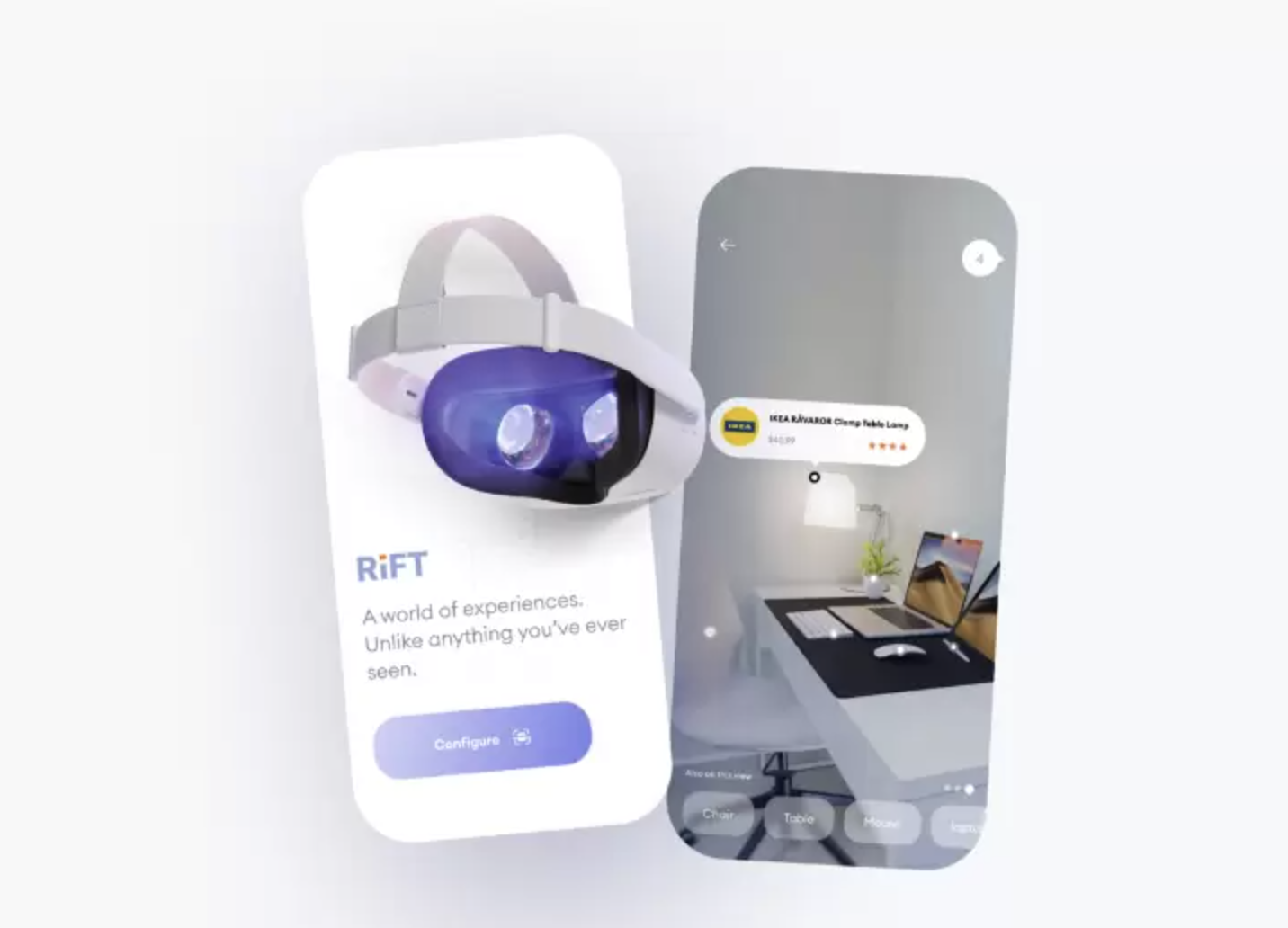
VR and AR are not only UI trends, but are also represented by a large category that has its own fashion trends. The Covid pandemic played a big role in their popularity, forcing app developers to use augmented reality, squeezing the best out of it. For example, in isolation, it was possible to walk around the world's museums looking at valuable exhibits without the visitor even having to get out of their favorite pajamas.
This year and next year, the use of augmented reality combined with artificial intelligence will be in demand in areas ranging from commerce to navigation and other areas.
14. Emotional Design
Attractive design helps establish a close connection with your audience. Visual "live" elements evoke different feelings and reactions from viewers, draw attention to the site and make it easier to sell. You should use bright colors to highlight the main parts of the UI/UX section. For example, an original design in the style of the 90s evokes a sense of nostalgia. You can use the idea as a reference to the past using modern technology.
15. Geometric Structure
It's a classic that doesn't go out of style, the basic rules remain. If you're not ready to be innovative, it's important to create a structured website or design a mobile app using geometric shapes.
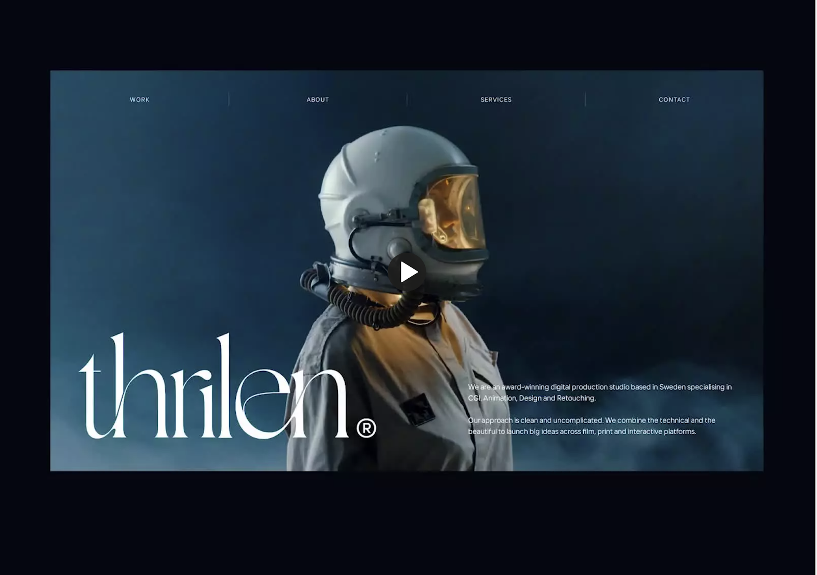
16. Dark Design
The popularity of the feature will only grow. In addition, in 2022, companies will offer several design options. The user will be able to choose the interface that is the most pleasant for him, corresponding to his preferences.
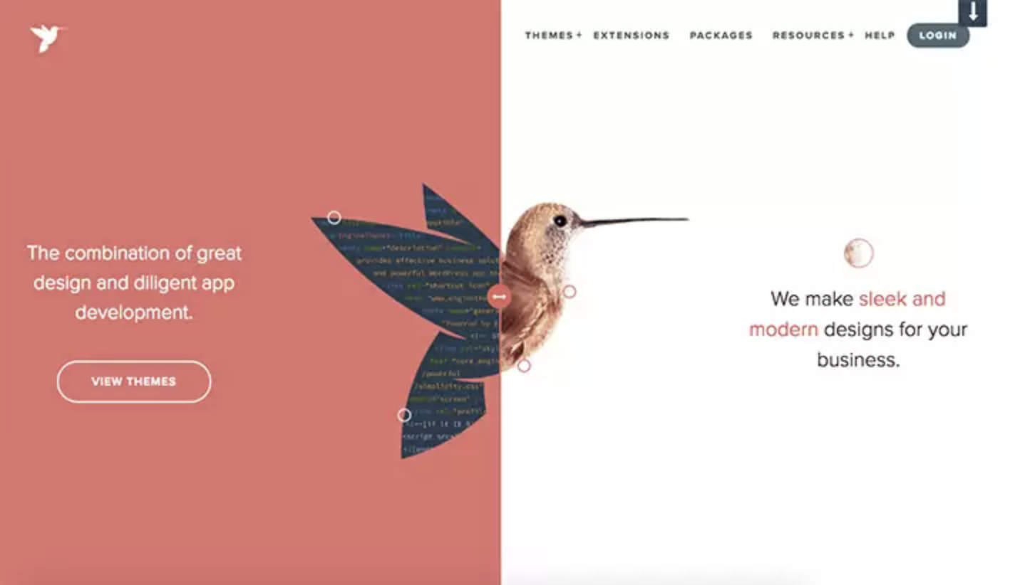
17. Split-Screen Design
The screen is conventionally divided into two content panels and collapses into a vertical block in the user interface on a small device. It allows you to create content that not only works well on different gadget models, but also looks good. The main reason for its popularity is that the website design has to match the mobile app.
Important points to keep in mind at all times
-
3D on the user interface
-
Color Harmony
One of the most important elements of any design is color. The trend right now is toward natural and light colors. With color you can highlight content, reinforce a company's style, and emphasize important elements. The layout should be designed so that everything looks harmonious. The UI elements and the surface of the product should be different from each other, but still match each other.
Surface in this case means cards, components, tiles, and canvases. Thus, we mean each element superimposed on top of the main background. Surfaces can have a soft shadow, which creates a specific floating effect. The background can be either light gray or white.
-
Animation
A design without animation looks unfinished and static. There are several ways to create it.
Animation has many advantages.
First, it should not be perceived as just moving elements. This is a component of the design, which attracts the attention of visitors to the product. Every object in motion contains a part of gamification. Today it is a very popular factor with the audience. There is another point - with a minimum of effort, you can fulfill the business objectives.
For example, with the help of micro-animation you can encourage the user to make a small step, which he forgot or did not even think to perform. We are talking about writing a comment. Also micro-animation will be a great reason to give aike.
Now in the trend for sophisticated elements of animation. But the web-designer should not forget that it is very easy to hide behind the movement of objects informational message. It's better to use animation for the good of the business, rather than miss the chance to take the best out of it.
-
Product illustration and the culture of its creator
-
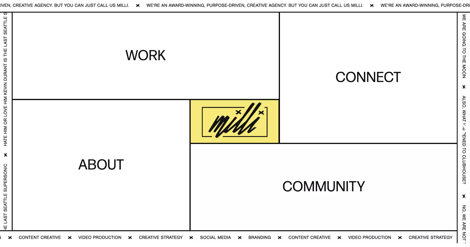
Asymmetry
A convenient design way to display a harmonious picture of the web interface, avoiding the usual solutions and chaos. With asymmetry, a web designer can play with geometric shapes, different elements, 3D-rendering, and get an original result. It is very important not to lose the edge and understand that people first notice only large elements, and then other information.
-
Real pictures
Scenery is no longer in vogue, so put photoshopped images aside and prefer natural ones. Such a technique makes it easier for potential customers to make contact. For example, if we are talking about a network that allows customers to buy sushi, then an excellent solution would be to put a photo of this dish on the portal. Conversion is sure to increase.
Applying real photographs of products, combining them with modern technology, you can achieve a realistic image on the site, attracting the attention of potential customers and stimulating their desire to make an order.
-
Current Changes
Matching your design to the real world and what's going on in it will differentiate you from your competitors. Minor but memorable changes to your homepage, logo, background, or blog on different holidays add uniqueness to your brand, make you linger on the page, pay attention, and remember.
-
Neomorhism
-
Glassmorphism
-
Pastel colors
-
Scroll
-
Material Design 3
UX Design
Dark mode
Moreover, website developers in 2022 will increasingly create several variants of pages at once, so that the user can choose a design that is more suitable for his preference. Some resources, as my analysis has shown, are already adding a button to the home page that allows you to switch the design.
Reasons for the popularity of the dark theme:
- the possibility to highlight individual design elements;
- conserving the charge of your mobile device;
- minimal strain on eyesight.
A design update will give a new look to an existing application.
Abstract Data Visualization
The benefits of abstract visualization:
- Improvement of communication with the potential user;
- minimal waste of time to get to know the services or product;
- imitation of site depth;
- originality;
- creating a functional user interface.
User experience comes first.
Inclusive Design
Inclusive design takes into account the needs of different groups of people. This involves creating a UX design that cares about the elderly, children, people with disabilities, etc.
The best way to take everyone's abilities into account is to learn from their needs. You're creating a product for millions of people around the world, and you need to make it accessible and understandable for each of them. Web Content Accessibility Guidelines (WCAG) is an excellent initiative that brings together methodologies for creating accessible web design. For example, Intercom Messenger follows all the rules of WCAG, providing support for screen readers, keyboard navigation and a limited color palette.
Another thing you need to think about is users' points of view. The best way to respect each user's point of view is to work with abstract terms. Imagine a default avatar on some social networking site. If a person enters "male" in the gender field, you would probably set the default image to depict a healthy bearded man with male facial features. However, all users are individual. Some users may not associate themselves with the avatar you assign them.
That's why it pays to think of people as something abstract. Lemonade Insurance Company is a great example of how to deal with this problem. When the website asks about users' roommates, it doesn't portray users as real people. It shows "roommates" as a couple of beers, "partners" as two glasses of wine, and "kids" as a pack of juice. With this approach, the company distances itself from gender and relationship stereotypes.
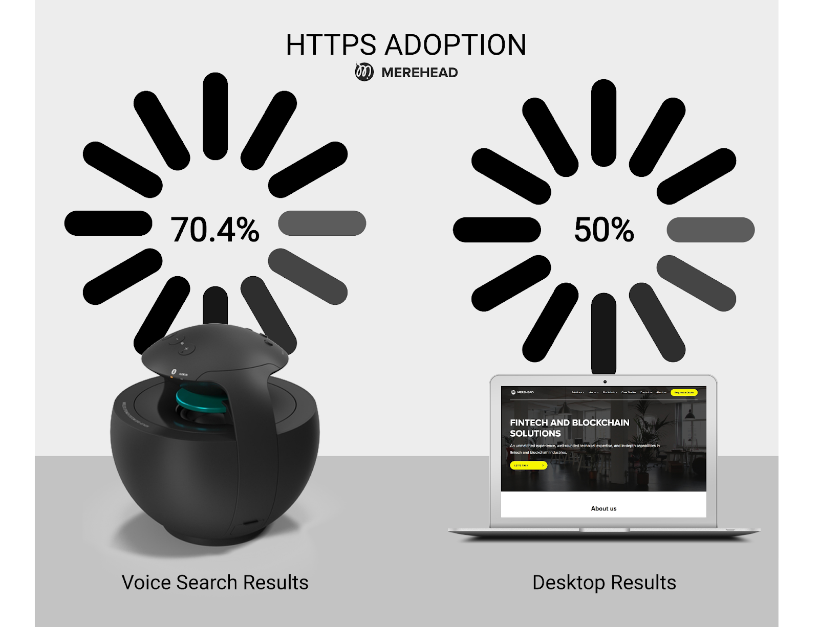
Manual or voice search?
More than 70% of users now choose voice search and smartphone control. It saves time, effort and does not make you take your phone in your hands unnecessarily if there is a special station with a voice assistant in the room. Next year, developers plan to further improve the functionality of this UX direction.
Microinteraction
Micro Interaction consists of such elements:
- presence of tactile feedback in the mobile app;
- the possibility of changing the hue for different program states;
- visualization of the required page loading;
- Adding animation when transitioning;
- original reaction to pressing certain buttons on the site.
This is a new approach that will make interaction with a page or app more "warm. Each user will be able to feel unusual contact with the resource and will be more likely to want to stay on it. The presence of micro interactions on the resource will have a favorable effect on the reputation of the company and will definitely be able to interest users.
Categories
About the author

UI/UX Designer at Software Development Hub with 4+ years experience. Skilled in designing mobile app, websites, SaaS products. She is passionate about improving how people engage with interfaces, focusing on creating seamless, user-centered designs that not only look appealing but also feel intuitive.
Share


Need a project estimate?
Drop us a line, and we provide you with a qualified consultation.