How Does Fitts' Law Work in Design?
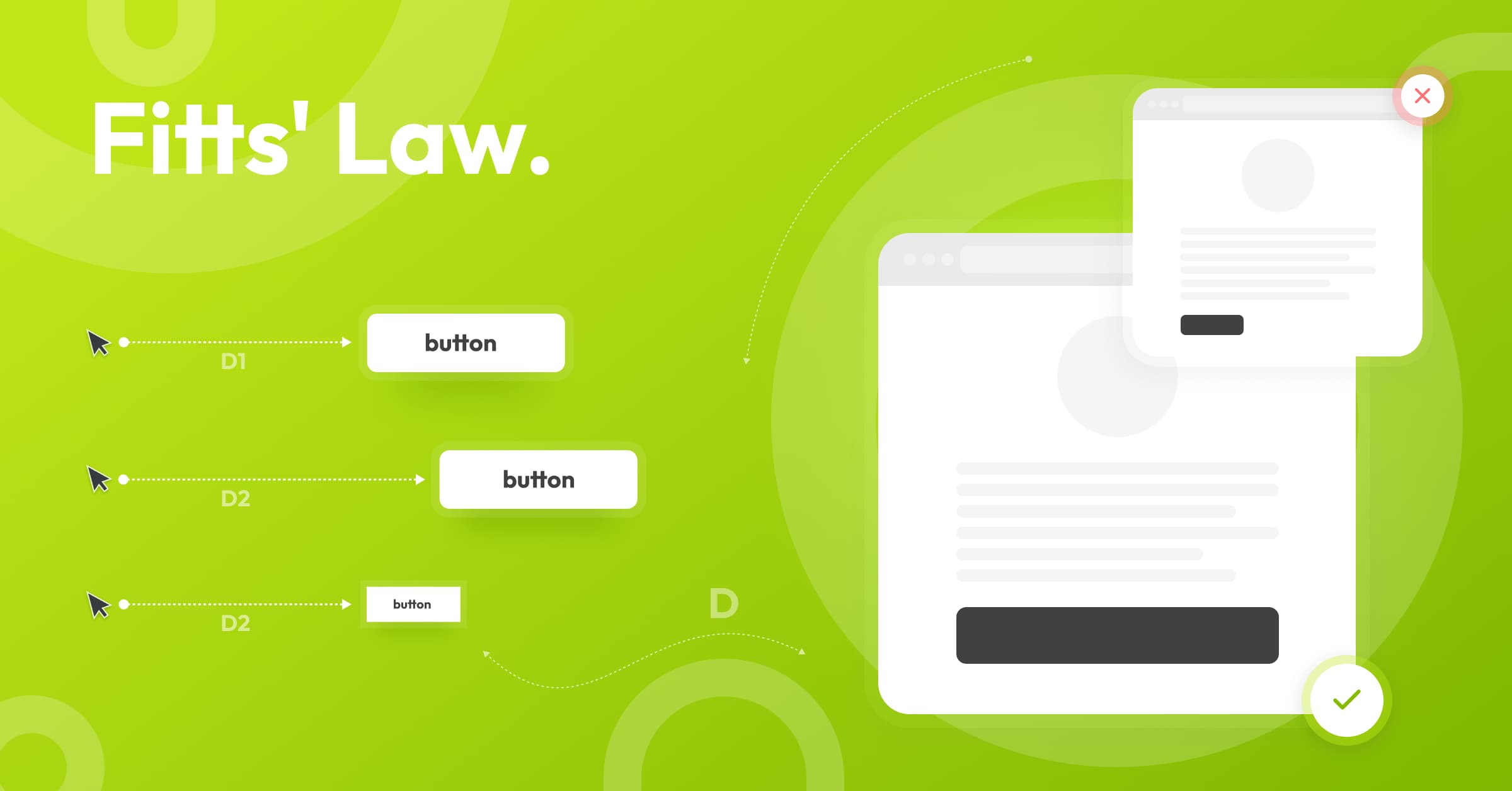
In 1954, psychologist Paul Fitts published a law which states that the time it takes to move toward a target depends on the distance to it but is inversely proportional to its size.
"The time it takes to capture a target depends on the distance to the target and its size."
Although this law originated long before the advent of the Internet, UI/UX designers widely use it.
What does it mean in design?
- The objects the user needs to interact with should be BIG enough so that users can interact with them without problems.
- The objects should have a sufficient DISTANCE between them.
- Touch buttons and interactive elements must be located so the user can easily reach them.
For example, the desired action is for the user to press a particular button. So it must be large enough, visible, not overlapping with other objects in the interface and placed on the screen within a range of the finger. At the same time, small buttons are harder to press (and take longer to do).

Designers at SDH told where else they apply Fitts' Law:
"We usually consider the position of the user's cursor at the moment of transition to a new page when we design web and mobile apps. The designer's task is to minimize the distance from the original pixel to the target object, which is exactly Fitts's law. The designer should predict where the user's cursor is during the transition to the page to minimize the distance to the target action. That is when the button on all pages is in the same place, and you click "Next" — this is no accident.
Daria, Designer at Software Development Hub
"You've probably seen sites where the search bar is located in the site's header? It's all about the fact that the eye scans the page with an F, and eye movement and the cursor are closely linked. Accordingly, from the cursor to the search is the minimum distance and the visitor can find the product he wants."
Paolo, Designer at Software Development Hub
More often than not, designers use Fitts' Law to speed up user interaction with target elements. Still, you can also slow down interaction for the sake of accuracy. For example, the related items should be placed farther away from the "Add to cart" button. It will force users to be more careful when selecting related products, avoiding mistakes and accidental purchases of unwanted items.
Categories
About the author
Share
Need a project estimate?
Drop us a line, and we provide you with a qualified consultation.


