Examples of Data Visualization
Financial Data Visualization
Healthcare Analytics
E-commerce Sales Analysis
Social Media Analytics
Environmental Monitoring
What Makes Data Visualization Effective?
Types of Data Visualization in Data Science
Data Visualization Process/Workflow
Data Types by Data Visualization
Tools and Software for Data Visualization
Tableau
Power BI
QlikView
Google Data Studio
D3.js
Plotly
Tableau Public
Looker
Excel
Data Visualization Best Practices
AI Data Visualization: Types, Examples, and Tools

As the digital landscape continues to evolve, data has become the lifeblood of businesses across the globe. In the age of Big Data, harnessing the power of information is pivotal for making informed decisions.
AI data visualization has emerged as a powerful tool for businesses to turn raw data into actionable insights. In this article, we will explore the world of AI data visualization, its various types, examples, and the tools that make it possible. Additionally, we'll delve into the advantages and disadvantages of data visualization and discuss best practices to help you make the most of this transformative technology.
Examples of Data Visualization
Before we delve into the intricacies of AI data visualization, it's essential to understand how it's applied in real-world scenarios. Let's explore some compelling examples:
Financial Data Visualization
Financial institutions utilize data visualization to track market trends, monitor investments, and make strategic decisions. Interactive dashboards and charts enable them to visualize stock performance, currency fluctuations, and portfolio diversification, aiding in risk management and profitability analysis.
Healthcare Analytics
In the healthcare sector, data visualization plays a critical role in patient care and resource allocation. For instance, healthcare professionals can create visualizations to track patient records, monitor disease outbreaks, and optimize hospital resource allocation during a pandemic, such as the COVID-19 crisis.
E-commerce Sales Analysis
E-commerce businesses use data visualization to gain insights into customer behavior, optimize product recommendations, and enhance the overall shopping experience. Interactive sales reports, heat maps, and funnel analysis charts help them understand which products are popular and how users navigate their websites.
Social Media Analytics
Social media platforms generate massive amounts of data every second. Companies like Facebook and Twitter use data visualization to understand user engagement, track trending topics, and improve their algorithms. This enables them to deliver personalized content and advertisements to users, enhancing their platform's overall user experience.
Environmental Monitoring
Environmental organizations and government agencies employ data visualization to monitor environmental changes, track climate patterns, and assess the impact of pollution. Visualizations of temperature anomalies, sea-level rise, and carbon emissions help policymakers make data-driven decisions to combat climate change.
These examples illustrate the diverse applications of data visualization across various industries. What makes data visualization effective?
What Makes Data Visualization Effective?
Effective data visualization is not merely about creating pretty charts and graphs. It's about distilling complex data into a format that is easily understood and can drive meaningful insights. To achieve this, several principles come into play:
Clarity and Simplicity
The primary goal of data visualization is to communicate information clearly. Therefore, simplicity is key. Avoid clutter and unnecessary embellishments.
A clean, uncluttered visualization ensures that the message is not lost in a sea of data points.
Relevance
Ensure that the data you're visualizing is relevant to your audience and your objectives. Irrelevant data can confuse and distract from the core message.
Focus on what matters most.
Interactivity
Interactive data visualizations allow users to explore data on their own. This feature can help individuals gain deeper insights and uncover patterns and trends. Interactivity is particularly beneficial for complex data sets.
Storytelling
A data visualization should tell a story. Whether it's a narrative about financial performance, customer behavior, or environmental changes, the visualization should guide the viewer through the data, providing context and meaning.
Accuracy
Accuracy is paramount. Ensure that the data is up-to-date, and your visualizations are based on reliable sources. Any inaccuracies can lead to incorrect conclusions and potentially detrimental decisions.
Now that we understand the principles of effective data visualization, let's explore the types of data visualization commonly used in the field of data science.
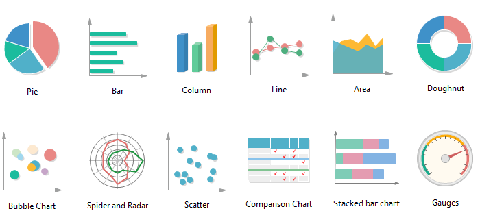
Types of Data Visualization in Data Science
Data visualization comes in various forms, each suited to specific data types and objectives. Here are some common types of data visualization:
- Bar Charts. Bar charts are excellent for comparing different categories or groups. They display data as horizontal or vertical bars, making it easy to identify trends and disparities.
- Line Charts. Line charts are ideal for showing trends over time. They connect data points with lines, providing a clear representation of how a variable changes over a specific period.
- Pie Charts. Pie charts are used to display parts of a whole. They show the distribution of a dataset into different categories as a proportion of the total.
- Scatter Plots. Scatter plots display individual data points on a two-dimensional graph. They're useful for identifying correlations and relationships between two variables.
- Heatmaps. Heatmaps use colors to represent data values. They're commonly used to visualize the concentration of data points within a matrix, making them great for identifying patterns.
- Choropleth Maps. Choropleth maps use color-coded areas, typically countries or regions, to represent data. They're frequently used in geographic and demographic analyses.
- Bubble Charts. Bubble charts combine elements of scatter plots and pie charts. They use circles of varying sizes to represent data points in a two-dimensional space.
- Sankey Diagrams. Sankey diagrams visualize the flow of data or resources between different entities. They're excellent for displaying processes or flows.
- Tree Maps. Tree maps represent hierarchical data as nested rectangles. They're useful for showing the breakdown of data into subcategories.
- Network Graphs. Network graphs display relationships between entities, with nodes and edges representing different elements and connections.
- Gantt Charts: Gantt charts are used to display project schedules, with tasks represented as bars along a timeline.
These are just a few examples of data visualization types, each with its own use case. The choice of visualization depends on the data you have and the message you want to convey.
Data Visualization Process/Workflow
Creating effective data visualizations follows a structured process. Here's a simplified workflow for AI data visualization:
- Data Collection. The first step is to gather relevant data from various sources, including databases, APIs, and spreadsheets.
- Data Cleaning. Data often requires cleaning to remove inconsistencies, missing values, and errors. This step ensures the data is reliable and accurate.
- Data Transformation. Depending on the visualization type, data may need to be transformed, aggregated, or summarized to make it suitable for presentation.
- Choosing Visualization Type. Select the appropriate visualization type that best represents the data and aligns with your objectives.
- Design and Creation. Create the data visualization using specialized tools and software. Pay attention to design principles, ensuring clarity, relevance, and accuracy.
- Interactivity. If needed, add interactive features that allow users to explore the data further.
- Testing. Test the visualization to ensure it accurately represents the data and effectively conveys the intended message.
- Deployment. Deploy the visualization through dashboards, reports, or websites, making it accessible to the intended audience.
- Continuous Monitoring: Continuously monitor the data to keep visualizations up-to-date and relevant.
Now that we understand the process, let's explore the tools and software that enable data visualization, including their application in REST API development.
Data Types by Data Visualization
Here's a table that lists some common data visualization types and the typical data formats they are suited for:
|
Data Visualization Type |
Suitable Data Types |
|
Bar Charts |
Categorical data, counts, percentages |
|
Line Charts |
Time series data, numeric data |
|
Scatter Plots |
Numeric data, correlations |
|
Pie Charts |
Parts of a whole (percentages) |
|
Histograms |
Numeric data, frequency distributions |
|
Box Plots |
Numeric data, distributions, outliers |
|
Heatmaps |
Categorical data, correlations, matrices |
|
Bubble Charts |
Numeric data, size-related data |
|
Choropleth Maps |
Geographic data, numeric values |
|
Tree Maps |
Hierarchical data, part-to-whole relationships |
|
Sankey Diagrams |
Flow data, resource allocation, processes |
|
Word Clouds |
Text data, word frequencies |
|
Network Graphs |
Relationship data, nodes, and edges |
|
Gantt Charts |
Project schedules, tasks, timelines |
|
Radar Charts |
Multivariate data with multiple attributes |
|
Parallel Coordinates Plot |
Multivariate data with multiple attributes |
|
Sunburst Charts |
Hierarchical data, part-to-whole relationships |
Keep in mind that the suitability of data types for each visualization type can vary, and there can be overlap. The key is to choose the visualization method that best represents the relationships and patterns in your specific dataset and the insights you want to convey.
Tools and Software for Data Visualization
The field of data visualization offers a multitude of tools and software to help businesses create compelling visualizations. These tools range from simple, user-friendly applications to advanced platforms with AI capabilities. Here are some popular choices:
Tableau
Tableau is a widely used data visualization tool that offers a range of features for creating interactive and shareable dashboards. It's an excellent choice for those looking to turn raw data into actionable insights.
Power BI
Developed by Microsoft, Power BI is a robust tool for data visualization and business intelligence. It's particularly useful for integrating with various data sources and REST APIs.
QlikView
QlikView provides a self-service business intelligence platform that allows users to create interactive visualizations and reports.
Google Data Studio
This free tool by Google enables users to create custom reports and dashboards that can be easily shared with others. It integrates seamlessly with various Google products and REST APIs.
D3.js
D3.js is a JavaScript library for creating data visualizations on the web. It provides flexibility and customization for developers to craft unique visualizations.
Plotly
Plotly is known for creating interactive web-based visualizations. It supports a variety of programming languages, including Python and R, making it a versatile choice.
Tableau Public
If you're looking for a free version of Tableau for sharing public visualizations, Tableau Public is an excellent choice. It's a cloud-based platform that allows users to publish and share their work.
Looker
Looker is a data exploration and business intelligence platform that empowers organizations to harness their data and integrate it with REST APIs for in-depth analysis.
Excel
Microsoft Excel is a versatile tool for creating basic data visualizations. While it may not offer the advanced features of specialized software, it's a familiar choice for many.
These tools and software platforms cater to a wide range of users, from business analysts to data scientists. They offer varying levels of complexity and customization, ensuring there's a solution for every need.
Data Visualization Best Practices
To ensure that your data visualizations are effective and meaningful, here are some best practices to follow:
- Know Your Audience: Tailor your visualizations to the specific needs and knowledge level of your audience.
- Choose the Right Visualization Type: Select a visualization that best represents your data and aligns with your objectives.
- Keep it Simple: Avoid clutter and unnecessary embellishments, focusing on clarity and relevance.
- Label Clearly: Ensure that labels, axes, and legends are clear and concise, providing context to your audience.
- Use Color Mindfully: Use colors to highlight important information and ensure accessibility for all users, including those with color blindness.
- Test and Iterate: Test your visualizations with sample users and be open to making improvements based on their feedback.
- Keep Data Updated: Regularly update your data to ensure the accuracy and relevance of your visualizations.
- Share Insights, Not Just Data: Add annotations and narratives to your visualizations to guide users through the data.
- Maintain Data Privacy: Be cautious when sharing visualizations to avoid disclosing sensitive information.
By following these best practices, you can create data visualizations that have a meaningful impact on your audience and help drive data-driven decisions.
In conclusion, AI data visualization is a powerful tool that allows businesses to turn raw data into actionable information. With the right tools, clear goals, and an understanding of best practices, you can harness the full potential of data visualization in your organization. SDH company will help provide assistance in data visualization. Analyzing the tasks and the specifics of your company’s work, specialists will provide tools for developing and scaling your business.
Categories
About the authors

UI/UX Designer at Software Development Hub with 4+ years experience. Skilled in designing mobile app, websites, SaaS products. She is passionate about improving how people engage with interfaces, focusing on creating seamless, user-centered designs that not only look appealing but also feel intuitive.
Share


Need a project estimate?
Drop us a line, and we provide you with a qualified consultation.